Cultural Currency 20: “Calligraphy Strayed from the Beaten Path” (a Study: Osaka Kansai International Art Festival program) @ Ichion Contemporary B2
A transit point
By Shimizu Minoru
2024.01.31
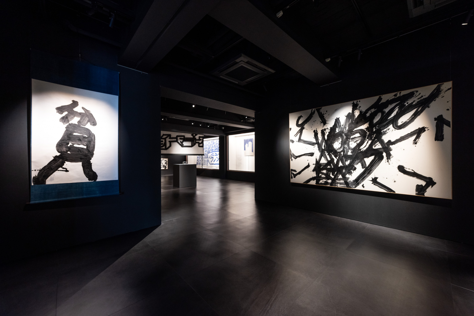
Photo by Kohei Matsumura
“Calligraphy strayed from the beaten track” (curator: Kutsuna Miwa), held as part of Study: Osaka Kansai International Art Festival Vol. 3, has attracted a lot of attention. This is a group show featuring work by four artists affiliated with ART SHODO CONTEMPORARY: Yamamoto Hisashi, Hashiguchi Rintaro, Goo Nakayama and Hino Kimihiko, along with work by Inoue Yuichi. ART SHODO CONTEMPORARY was founded six years ago by Yamamoto Hisashi as a movement to promote “calligraphy as contemporary art / contemporary art as calligraphy,” with the Tensakukai (2004–), a group established to pay homage to Inoue Yuichi and dedicated to the “liberation of calligraphy,” as its parent body (taking over from its predecessor MIRAI SHODO 2017, ART SHODO CONTEMPORARY was launched in 2018 as ART SHODO and adopted its current name to in 2023).
Calligraphy and contemporary art first came together in the 1950s, and one could say it was in the context of this East-West cultural exchange that the world got a glimpse of the first “art shodo.” In the final analysis, however, in both the East and the West, this first “art shodo” ended up as a brief episode. This was because on the one hand, under the consciously or unconsciously colonial gaze of Western artists of the time, the calligraphy of Japan, a defeated nation, was nothing more than another form of exotic abstract painting, and accordingly their understanding of calligraphy remained at a purely retinal level, while on the other hand, Japanese calligraphy artists’ understanding of “abstraction” was nothing more than a temporary fad that failed to take into account the history of Western painting that gave rise to it. Abstract calligraphy continued to be produced even after this crossing of paths dubbed an “exchange,” but it never found its way beyond the small calligraphy world. Calligraphy that relies on visual language, such as the power of the strokes; the depth of the black ink; the density, concentration and diffusion of the lines; and up, down, left and right movement, is more likely to appeal to today’s general audience, who cannot read cursive styles of writing. In other words, abstract calligraphy ought to present less of an obstacle, but it never became popular, and calligraphy entered a long blank period in which it did nothing but covet vested interests in the small calligraphy world and in school calligraphy.
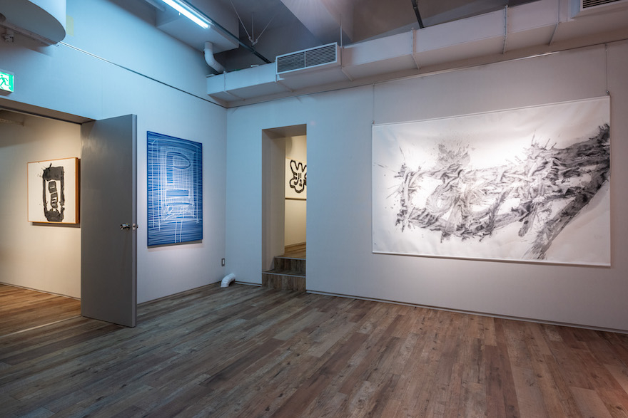 In the 21st century, as Inoue Yuichi has become recognized internationally, contemporary art and calligraphy have once again begun to close in on each other, and people are exploring what post-Yuichi (grounded in Yuichi, beyond Yuichi) calligraphy might look like. In this regard, ART SHODO has achieved remarkable progress in recent years, and it was this catching the attention of the curator, plus the locational advantage of its staging (an auction house with numerous Yuichi works) that probably led to this exhibition, where the present state of post-Yuichi calligraphy could clearly be discerned.
Inoue Yuichi (six works by Yuichi are displayed: Tori [Bird], Hin [Poverty], Yume [Dream], En [Circle], Hosai ku hechima and Kakinomoto no Hitomaro uta naru kami no) tried his hand at abstract calligraphy for a time, but returned to character/letter-based calligraphy with his famous Gutetsu [Persistence] (1956). Being grounded in Yuichi means first of all recognizing that calligraphy is writing. On this basis, Yuichi’s works force each of the ART SHODO artists to determine their attitude toward the following: 1. What does it mean that calligraphy is writing? (What is writing, or in other words what is the essence of the art of calligraphy?) 2. Visual beauty (the beauty of brushstrokes and black ink) 3. Readable or unreadable (where is the message?) 4. The single character format.
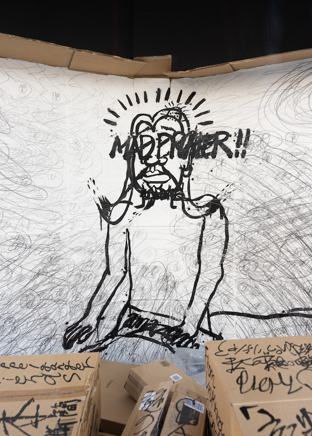 The works of the four living artists can be divided into readable calligraphy and unreadable calligraphy. The works of Hashiguchi Rintaro, who scrawls (what appear to be) English vocabulary using a towel soaked in black ink, comprise text-based calligraphy that is sometimes readable and sometimes not and drawings. The former are punk war cries that at first glance resemble graffiti. As mentioned above, for people today, calligraphy is entirely something that is looked at and not read, so Rintaro compensates for the weakness arising from this in the form of a propensity to degenerate into commonplaceness with a unique installation using Amazon cardboard boxes. For Rintaro’s calligraphy is also “socially engaged art” that tries to explode by way of an original tale of a near-future savior the crisis whereby global capitalism is permeating deeply even underpopulated regions in various countries, resulting in local communities coming to rely completely on global corporations (due to the rise of Amazon and other online shopping companies, so-called “shutter streets” where almost every locally owned store has been forced to close its doors are becoming a common sight). Because it is supported by a socially critical concept expressed through an installation, the visual simplicity of Rintaro’s calligraphy (which in itself is not something that should be criticized) gets off without being ineffective. Coming at it from the opposite angle, while it is effective as artwork precisely because the sense of liveliness of the calligraphy and the concept are in balance, for the most part the concept is overwhelmed by the visual effects. This is perhaps something to be addressed going forward.
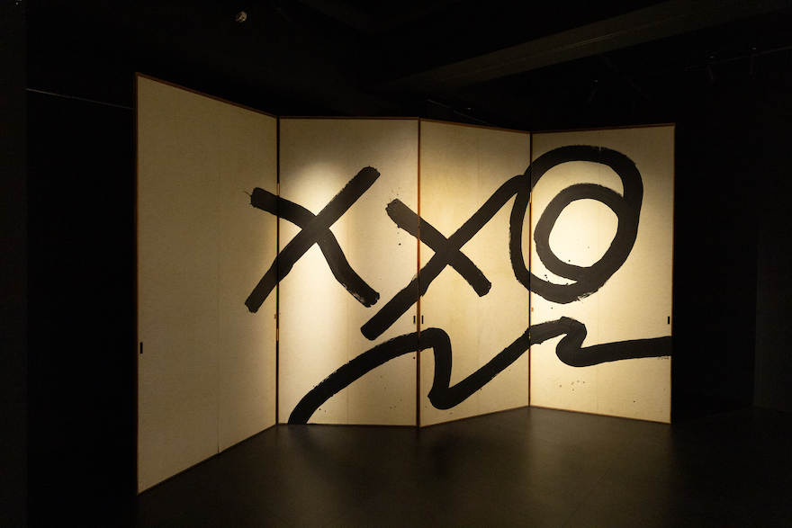 Goo Nakayama’s calligraphy is “unreadable writing.” Nakayama creates new characters (“Goo characters,” as it were) one by one in accordance with his own sensibility, and has won praise due to the appeal of their peculiar, clumsy forms. Goo characters have meaning, but like the writing of an unknown foreign language or symbols that could be either writing or pictures (ancient Japanese characters, Nazca lines, etc.), they cannot be read. The theme of Goo Nakayama’s calligraphy is the miracle of shapes taking on meaning. In other words, the subject is the difference between when a certain figure is a picture and when it is a character.
 Following the example of kanji, Goo characters were first realized as symbols that resembled actual forms (flowers, etc.) before ultimately evolving into symbols of amorphous feelings and concepts, with this occurring in the context of the single character format. Recently, the artist has come to understand that rather than individual forms having meaning in themselves, they gain meaning through their relationship with other forms, and while he is embarking on expression stringing together multiple Goo characters in an effort to break the “single character calligraphy” spell that is a negative legacy of earlier abstract calligraphy, successful examples of this new approach have yet to materialize. The biggest problem is that the existing symbols (X marks, etc.) that are mixed in with the Goo characters produce a different kind of signification, and here alone the world of Goo characters completely unravels. This shortcoming remains uncorrected at this exhibition. The feeling that the work benefitted from the wonderful exhibition space was undeniable.
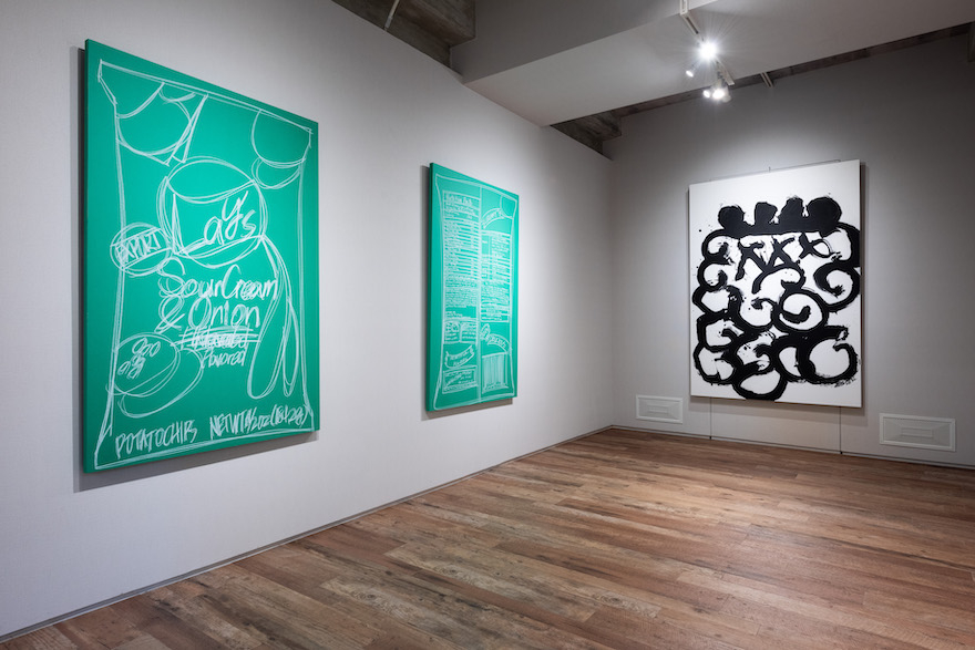
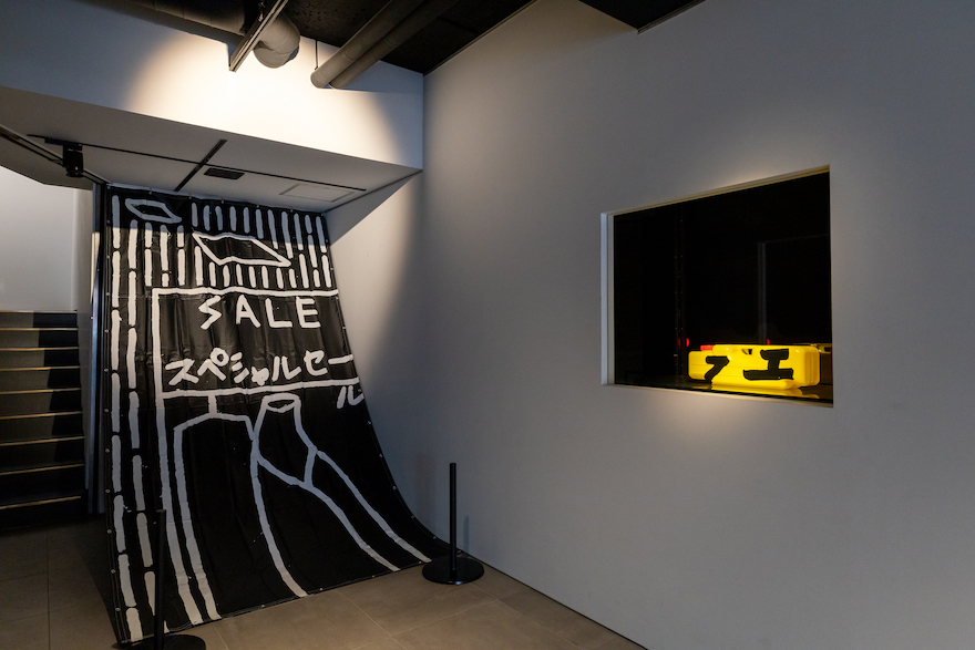 The calligraphy of the two remaining artists is calligraphy that can be read by everyone, and for this reason presents more of an obstacle in terms of acceptance. Hino Kimihiko’s calligraphy is both a successor to Inoue Yuichi’s “conte calligraphy” and personal, socially engaged art. In contemporary society that is pervaded by global capitalism, there is no place for the have-nots. The artist collects from the street letters and characters that clearly reflect such a society and expresses them in skeletally in line drawings. The results are the mutterings of people with no place to stay and no means of escape and a slightly miserable imagined landscape. In these works of calligraphy as the kinds of restrained messages that would never be published on social media and would in fact be suppressed before being uttered, the so-called beauty of black ink is abandoned, but the choice of the color of the paper and the color of the writing, the coarse and fine line drawing and the method of presentation employing the enormous sheets of paper used in advertising media reveal a unique aesthetic sense.
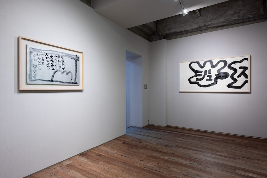 Finally, a word about the leader of ART SHODO, Yamamoto Hisashi.1 The foundation of Yamamoto’s calligraphy is “writing the name of a thing on that thing.” This involves the artist creating his own pictogram of a subject and writing on it the name of that subject, but because the pictograms are intentionally unclear, the act of writing a name is often also giving a name. Calligraphy as naming is a way of giving new life to the readymade world—which also includes language—by giving it its own name.
 ——————————–
1. For details, see Shimizu Minoru, “Na wo ataeru: Yamamoto Hisashi no sho” [Naming the World: the calligraphy of Yamamoto Hisashi] in Ugoku ki [Moving tree] (Art Diver, 2024). ——————————–
Shimizu Minoru
Critic. Professor, Doshisha University.
“Calligraphy Strayed from the Beaten Path” was held at ICHION CONTEMPORARY B2 from December 23, 2023 to January 31, 2024

(From left to right) Inoue Yuichi, En (Circle), Hino Kimihiko, Parking-VACANCY, Yamamoto Hisashi, Juice and Hashiguchi Rintaro, NEW SOLID GOGGLES, WLIGHTE
Photo by Kohei Matsumura
*

Hashiguchi Rintaro, Nazo no Hon [Enigmatic book] “they woke me up in a strange dream” (tentative)
Photo by Kohei Matsumura

Goo Nakayama, HECK22
Photo by Yoshiumi Haruki

Hino Kimihiko, Lay’s Sour Cream & Onion (left) and Goo Nakayama, ODD23
Photo by Kohei Matsumura

Hino Kimihiko, Tag – SALE (left) and Yamamoto Hisashi, Fue
Photo by Yoshiumi Haruki

Inoue Yuichi, Kakinomoto no Hitomaro uta naru kami no (left) and Yamamoto Hisashi, Juice
Photo by Kohei Matsumura

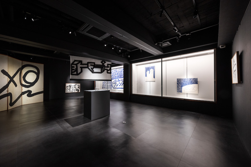
Installation view of “Calligraphy Strayed from the Beaten Path.”
Photo by Kohei Matsumura
1. For details, see Shimizu Minoru, “Na wo ataeru: Yamamoto Hisashi no sho” [Naming the World: the calligraphy of Yamamoto Hisashi] in Ugoku ki [Moving tree] (Art Diver, 2024). ——————————–
Shimizu Minoru
Critic. Professor, Doshisha University.
“Calligraphy Strayed from the Beaten Path” was held at ICHION CONTEMPORARY B2 from December 23, 2023 to January 31, 2024